R Project
Climate change and temperature anomalies
weather <-
  read_csv("https://data.giss.nasa.gov/gistemp/tabledata_v4/NH.Ts+dSST.csv",
           skip = 1,
           na = "***")
# SELECT YEAR, MONTHS AND PIVOT LONGER
weather %>%
select(1:13) %>%
pivot_longer(2:13, names_to = "month", values_to = "delta") -> tidyweatherPlotting Information
tidyweather <- tidyweather %>%
  mutate(date = ymd(paste(as.character(Year), month, "1")),
         month = month(date, label=TRUE),
         Year = year(date))

ggplot(tidyweather, aes(x=date, y = delta))+
  geom_point()+
  geom_smooth(color="red") +
  theme_bw() +
  labs (
    title = "Weather Anomalies",
    x = "Year",
    y = "Delta"
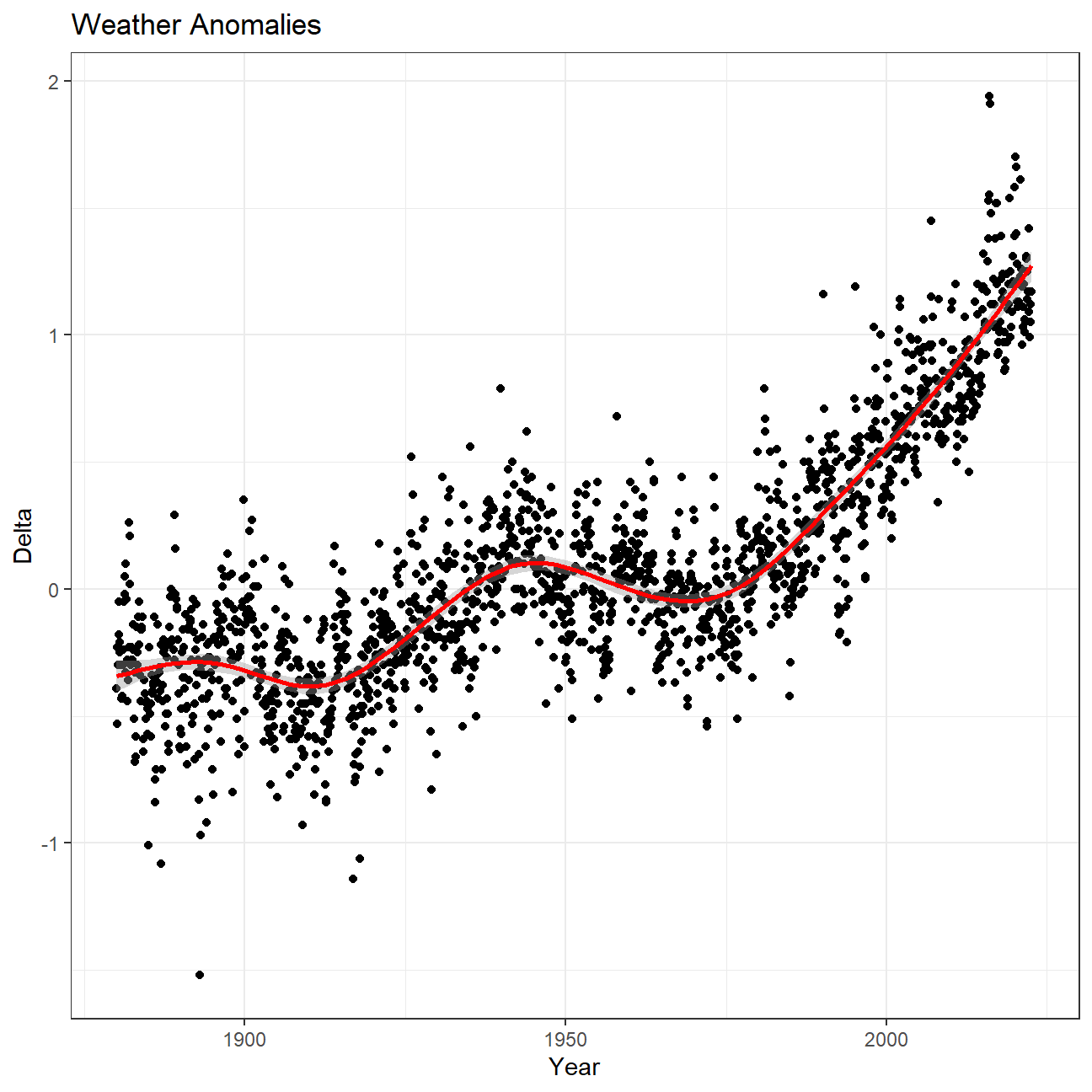
  )
ggplot(tidyweather, aes(x=date, y = delta))+
  geom_point()+
  geom_smooth(color="red") +
  facet_wrap(~month) +
  theme_bw() +
  labs (
    title = "Weather Anomalies",
    x = "Year",
    y = "Delta"
  )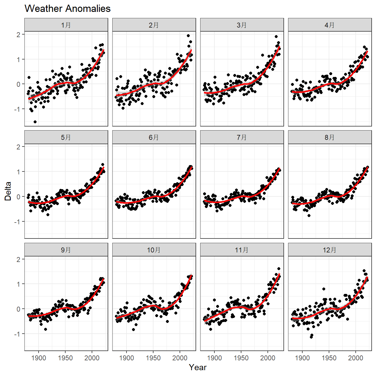
There is no apparent difference between the effects of increasing temperature in monthly data. January and February seem to represent the strongest change, but it does not vary significantly from other months.
comparison <- tidyweather %>%
  filter(Year>= 1881) %>%     #remove years prior to 1881
  #create new variable 'interval', and assign values based on criteria below:
  mutate(interval = case_when(
    Year %in% c(1881:1920) ~ "1881-1920",
    Year %in% c(1921:1950) ~ "1921-1950",
    Year %in% c(1951:1980) ~ "1951-1980",
    Year %in% c(1981:2010) ~ "1981-2010",
    TRUE ~ "2011-present"
  ))
comparison %>%
ggplot(aes(x = delta, fill = interval, color = interval)) +
geom_density(alpha = 0.3) +
labs (
title = "Weather Delta by Decade",
x = "Delta",
y = "Density",
fill = "Decade",
color = "Decade"
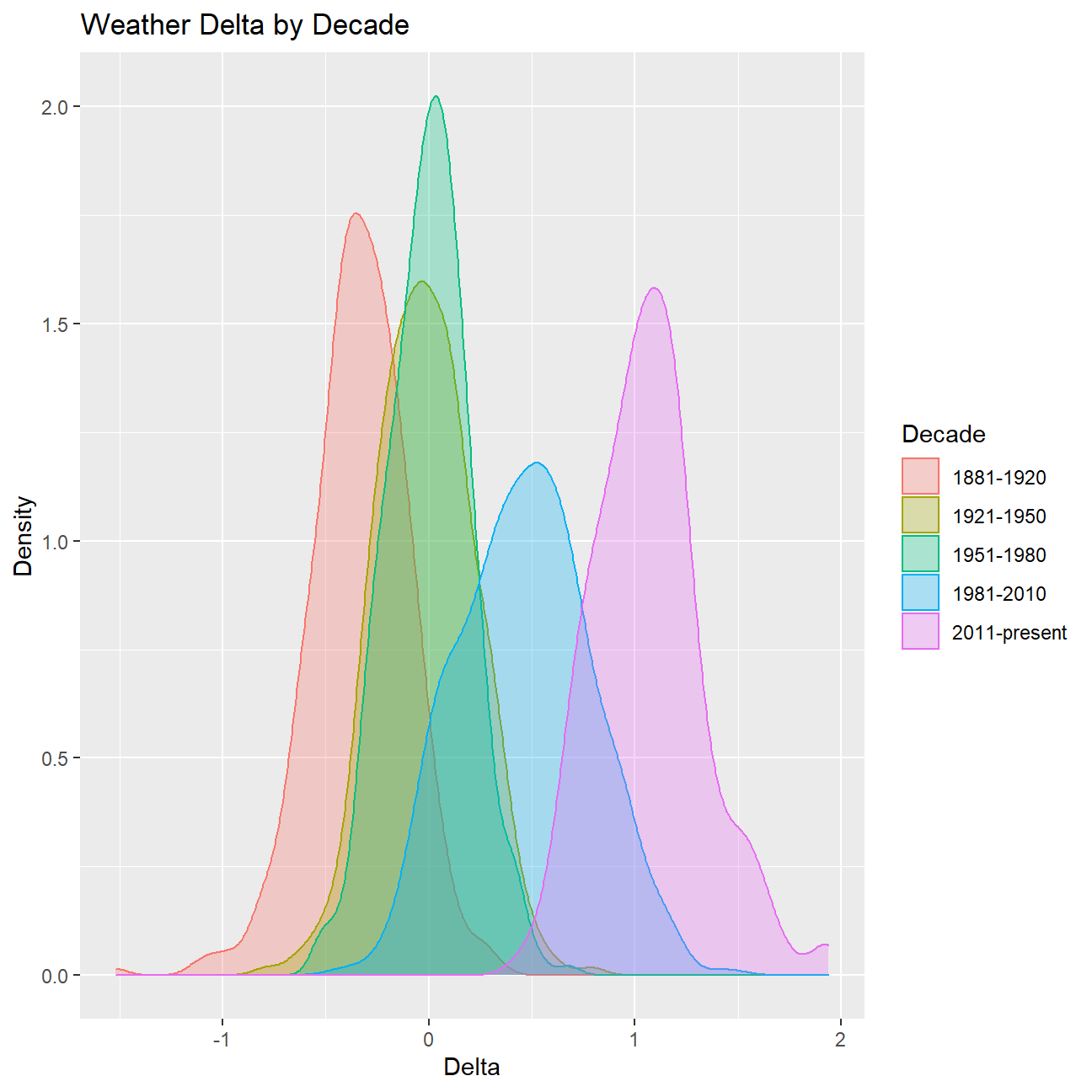
)
#creating yearly averages
average_annual_anomaly <- tidyweather %>%
  group_by(Year) %>%   #grouping data by Year
  # creating summaries for mean delta
  # use `na.rm=TRUE` to eliminate NA (not available) values
  summarise(mean_delta = mean(delta, na.rm=TRUE))

average_annual_anomaly %>%
  ggplot(aes(x=Year, y=mean_delta)) +
  geom_point(aes(color=mean_delta>0)) + # DRAWING POINTS ABOVE ZERO A DIFFERENT COLOUR
  geom_smooth(method = "loess", color="black") +
  theme_bw() +
  labs(
    title = "Weather Delta average by Year",
    x = "Year",
    y = "Mean Delta",
    color = "Above Zero"
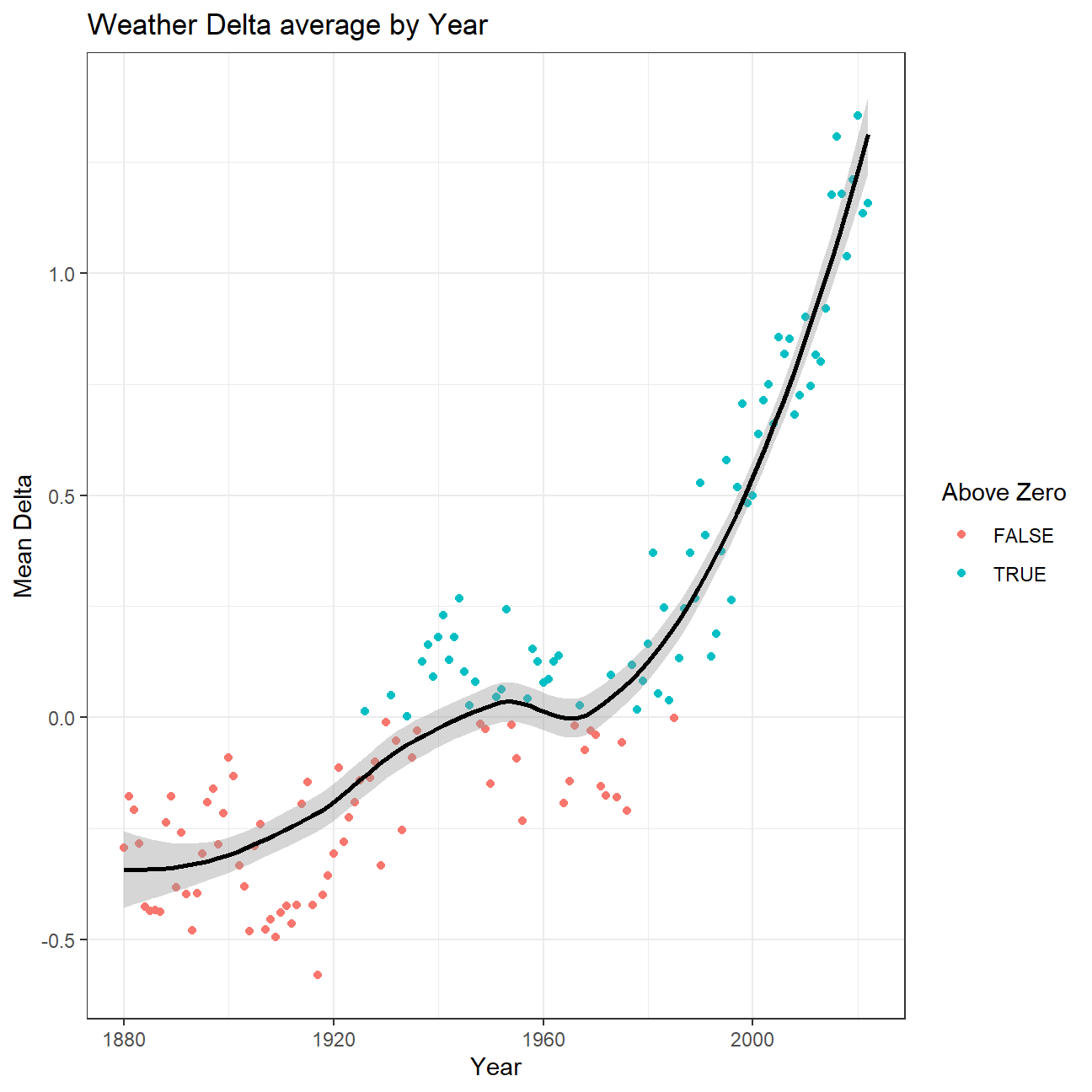
  )
Confidence Interval for delta
CI using formula
formula_ci <- comparison %>%

  # choose the interval 2011-present
  filter(Year >= 2011) %>%
  group_by(Year) %>%
  summarise(
    mean_delta = mean(delta),
    sd_delta = sd(delta),
    count = n(),
    # We're choosing a 95% confidence interval:
    t_critical = qt(0.975, count-1),
    se_delta = sd(delta/sqrt(count)),
    margin_of_error = t_critical*se_delta,
    delta_low  = mean_delta - margin_of_error,
    delta_high = mean_delta + margin_of_error
  )

  # calculate summary statistics for temperature deviation (delta)
  # calculate mean, SD, count, SE, lower/upper 95% CI
  # what dplyr verb will you use?

#print out formula_CI
formula_ci
## # A tibble: 12 × 9
## Year mean_delta sd_delta count t_critical se_delta margin_…¹ delta…² delta…³
## <dbl> <dbl> <dbl> <int> <dbl> <dbl> <dbl> <dbl> <dbl>
## 1 2011 0.745 0.113 12 2.20 0.0327 0.0720 0.673 0.817
## 2 2012 0.815 0.179 12 2.20 0.0517 0.114 0.701 0.929
## 3 2013 0.8 0.118 12 2.20 0.0340 0.0749 0.725 0.875
## 4 2014 0.92 0.145 12 2.20 0.0420 0.0924 0.828 1.01
## 5 2015 1.18 0.178 12 2.20 0.0515 0.113 1.06 1.29
## 6 2016 1.31 0.333 12 2.20 0.0961 0.212 1.10 1.52
## 7 2017 1.18 0.226 12 2.20 0.0653 0.144 1.03 1.32
## 8 2018 1.04 0.137 12 2.20 0.0396 0.0871 0.950 1.12
## 9 2019 1.21 0.153 12 2.20 0.0441 0.0970 1.11 1.31
## 10 2020 1.35 0.225 12 2.20 0.0648 0.143 1.21 1.50
## 11 2021 1.14 0.117 12 2.20 0.0339 0.0746 1.06 1.21
## 12 2022 NA NA 12 2.20 NA NA NA NA
## # … with abbreviated variable names ¹margin_of_error, ²delta_low, ³delta_highIn order to calculate the confidence intervals, we have calculated for every year many summary statistics including mean, SD, SE and sample size. Using these summary statistics we have calculated the t-Student distribution critical value, and multiplied the
t_criticalby the standard error to get the final margin of error. Finally we add and subtract the margin of error to the mean to get the limits of the interval. In order to fully understand the data we have collected, we have come up with the following visualization of the mean and confidence intervals:
formula_ci %>%
  mutate(Year = as.factor(Year)) %>%
  na.omit() %>%
  ggplot(aes(color = Year)) +
  geom_pointrange(aes(x=Year, y=mean_delta, ymax=delta_high, ymin=delta_low)) +
  theme_bw() +
  theme(legend.position = "none") +
  labs(
    title = "Weather Delta range by Year",
    subtitle = "NASA Weater Data",
    x = "Year",
    y = "Delta range",
    color = NULL
  )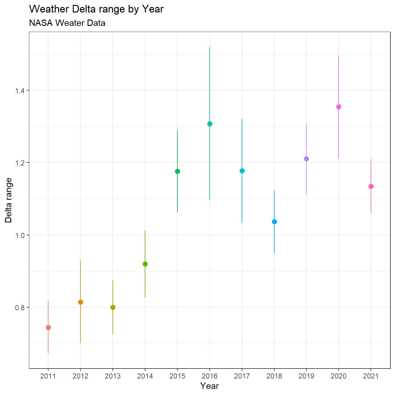
The visualization shows an increase in the mean over the years, reaching a first maximum in 2016, and an even higher maximum mean in 2020. For years with a higher mean delta, the confidence intervals seem to increase as well. With the current samples and intervals, we cannot say for sure that the mean delta in year 2016 was higher than the mean delta in 2017 for instance, but we can be sure with 95% confidence that 2011 was lower than 2016.
CI using formula (for all years)
Since there are not enough data points every year, the confidence intervals are very large and vary a lot by year. The total confidence interval for the entire period is as follows:
formula_ci_interval <- comparison %>%

  # choose the interval 2011-present
  filter(Year >= 2011) %>%
  na.omit() %>%
  group_by(interval) %>%
  summarise(
    mean_delta = mean(delta),
    sd_delta = sd(delta),
    count = n(),
    # We're choosing a 95% confidence interval:
    t_critical = qt(0.975, count-1),
    se_delta = sd(delta/sqrt(count)),
    margin_of_error = t_critical*se_delta,
    delta_low  = mean_delta - margin_of_error,
    delta_high = mean_delta + margin_of_error
  )

#print out formula_CI
formula_ci_interval %>% select(delta_low, delta_high)
## # A tibble: 1 × 2
## delta_low delta_high
## <dbl> <dbl>
## 1 1.02 1.11CI using bootstrapping
boot_dist <- comparison %>%
  # choose the interval 2011-present
  filter(Year >= 2011) %>%
  mutate(Year = as.factor(Year)) %>%
  specify(response=delta) %>%
  generate(reps=1000, type="bootstrap") %>%
  calculate(stat = "mean")

boot_dist %>%
  # Calculate the confidence interval around the point estimate
  get_confidence_interval(
    # At the 95% confidence level; percentile method
    level = 0.95
  )
## # A tibble: 1 × 2
## lower_ci upper_ci
## <dbl> <dbl>
## 1 1.02 1.11Biden’s Approval Margins
# Import approval polls data directly off fivethirtyeight website
approval_polllist <- read_csv('https://projects.fivethirtyeight.com/biden-approval-data/approval_polllist.csv')

glimpse(approval_polllist)
## Rows: 4,572
## Columns: 22
## $ president <chr> "Joe Biden", "Joe Biden", "Joe Biden", "Joe Biden"…
## $ subgroup <chr> "All polls", "All polls", "All polls", "All polls"…
## $ modeldate <chr> "9/19/2022", "9/19/2022", "9/19/2022", "9/19/2022"…
## $ startdate <chr> "1/19/2021", "1/19/2021", "1/20/2021", "1/20/2021"…
## $ enddate <chr> "1/21/2021", "1/21/2021", "1/21/2021", "1/21/2021"…
## $ pollster <chr> "Morning Consult", "Rasmussen Reports/Pulse Opinio…
## $ grade <chr> "B", "B", "B-", "B", "B", "B+", "B+", "B", "B-", "…
## $ samplesize <dbl> 15000, 1500, 1115, 1993, 15000, 1516, 941, 15000, …
## $ population <chr> "a", "lv", "a", "rv", "a", "a", "rv", "a", "rv", "…
## $ weight <dbl> 0.2594, 0.3382, 1.1014, 0.0930, 0.2333, 1.2454, 1.…
## $ influence <dbl> 0, 0, 0, 0, 0, 0, 0, 0, 0, 0, 0, 0, 0, 0, 0, 0, 0,…
## $ approve <dbl> 50.0, 48.0, 55.5, 56.0, 51.0, 45.0, 63.0, 52.0, 58…
## $ disapprove <dbl> 28.0, 45.0, 31.6, 31.0, 28.0, 28.0, 37.0, 29.0, 32…
## $ adjusted_approve <dbl> 49.4, 49.1, 54.6, 55.4, 50.4, 46.0, 59.4, 51.4, 57…
## $ adjusted_disapprove <dbl> 30.9, 40.3, 32.4, 33.9, 30.9, 29.0, 38.4, 31.9, 32…
## $ multiversions <chr> NA, NA, NA, NA, NA, NA, NA, NA, NA, NA, NA, NA, NA…
## $ tracking <lgl> TRUE, TRUE, NA, NA, TRUE, NA, NA, TRUE, NA, TRUE, …
## $ url <chr> "https://morningconsult.com/form/global-leader-app…
## $ poll_id <dbl> 74272, 74247, 74248, 74246, 74273, 74327, 74256, 7…
## $ question_id <dbl> 139491, 139395, 139404, 139394, 139492, 139570, 13…
## $ createddate <chr> "1/28/2021", "1/22/2021", "1/22/2021", "1/22/2021"…
## $ timestamp <chr> "09:58:31 19 Sep 2022", "09:58:31 19 Sep 2022", "0…# Use `lubridate` to fix dates, as they are given as characters.Create a plot
test_data <- approval_polllist %>%
  select('president', 'enddate', 'approve', 'disapprove', 'subgroup') %>%
  filter(president=='Joe Biden') %>%
  mutate(net_approval = approve-disapprove) %>%
  mutate(date = mdy(enddate)) %>%
  select(-enddate) %>%
  filter(year(date)==2022) %>%
  mutate(week_date = week(date)) %>%
  group_by(week_date, subgroup) %>%
  summarize(mean_net_approval = mean(net_approval),
            sd_net_approval = sd(net_approval),
            count=n(),
            t_critical = qt(0.95, count-1),
            se_net_approval = sd(net_approval)/sqrt(count),
            margin_of_error = t_critical * se_net_approval,
            net_approval_high = mean_net_approval + margin_of_error,
            net_approval_low = mean_net_approval - margin_of_error) #%>%


  ggplot(test_data, aes(x=week_date, y=mean_net_approval, color=subgroup, fill=subgroup)) +
  geom_line() +
  geom_ribbon(aes(ymin = net_approval_low, ymax = net_approval_high), alpha = 0.1) +
  #theme_minimal() +
  labs(title = "Biden's Net Approval Ratings in 2022", subtitle = "Weekly Data, Approve - Disapprove, %",
       x='Week in 2022', y='', caption = "Source: https://projects.fivethirtyeight.com/biden-approval-data/") +
  theme(legend.position = 'none') +
  facet_grid(vars(subgroup))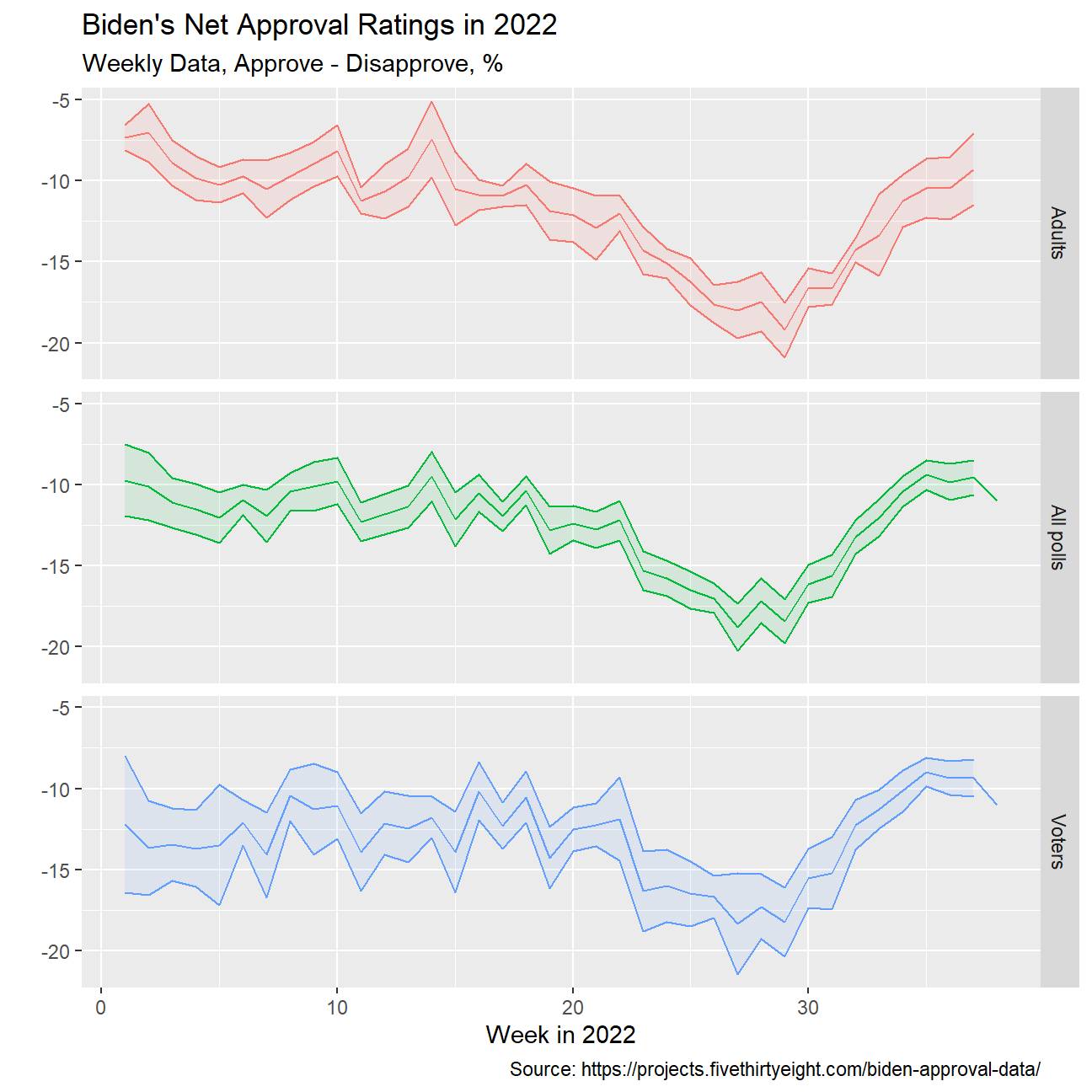
Challenge 1: Excess rentals in TfL bike sharing
Recall the TfL data on how many bikes were hired every single day. We can get the latest data by running the following <<<<<<< HEAD
url <- "https://data.london.gov.uk/download/number-bicycle-hires/ac29363e-e0cb-47cc-a97a-e216d900a6b0/tfl-daily-cycle-hires.xlsx"

# Download TFL data to temporary file
httr::GET(url, write_disk(bike.temp <- tempfile(fileext = ".xlsx")))
## Response [https://airdrive-secure.s3-eu-west-1.amazonaws.com/london/dataset/number-bicycle-hires/2022-09-06T12%3A41%3A48/tfl-daily-cycle-hires.xlsx?X-Amz-Algorithm=AWS4-HMAC-SHA256&X-Amz-Credential=AKIAJJDIMAIVZJDICKHA%2F20220919%2Feu-west-1%2Fs3%2Faws4_request&X-Amz-Date=20220919T144132Z&X-Amz-Expires=300&X-Amz-Signature=a8a78c5ce136bcb84080e2ff507b71ead92ea81f4427ca4e9863f2ec825eb691&X-Amz-SignedHeaders=host]
## Date: 2022-09-19 14:41
## Status: 200
## Content-Type: application/vnd.openxmlformats-officedocument.spreadsheetml.sheet
## Size: 180 kB
## <ON DISK> D:\TMP\RtmpATRL2i\file64246ed6140c.xlsx# Use read_excel to read it as dataframe
bike0 <- read_excel(bike.temp,
sheet = "Data",
range = cell_cols("A:B"))
# change dates to get year, month, and week
bike <- bike0 %>%
clean_names() %>%
rename (bikes_hired = number_of_bicycle_hires) %>%
mutate (year = year(day),
month = lubridate::month(day, label = TRUE),
week = isoweek(day))However, the challenge I want you to work on is to reproduce the following two graphs.
# knitr::include_graphics(here::here("images", "tfl_monthly.png"), error = FALSE)bike2 <- bike %>%
filter(year>2015) %>%
group_by(month,year) %>%
mutate(month=match(month,month.abb)) %>%
summarize(monthly_mean = mean(bikes_hired))
#mutate(lag_mean = lag(monthly_mean))
bike_2016_to_2019 <-bike %>%
filter(2015<year & year<2020) %>%
group_by(month) %>%
mutate(month=match(month,month.abb)) %>%
summarize(monthly_mean_2016_2019 = mean(bikes_hired))
bike_merged<-merge(x=bike2,y=bike_2016_to_2019,by="month") %>%
filter(year>2016)
bike_longer<-bike_merged %>%
pivot_longer(cols=3:4,
names_to="type",
values_to="n")
ggplot(data=bike_merged, aes(x=month)) +
geom_line(aes(y=monthly_mean)) +
geom_line(aes(y=monthly_mean_2016_2019), colour='blue',size=1) +
geom_ribbon(aes(x=month,
ymin = monthly_mean,
ymax = pmax(monthly_mean,monthly_mean_2016_2019),
fill = "red"),
alpha=0.1) +
geom_ribbon(aes(x=month,
ymin = monthly_mean_2016_2019,
ymax = pmax(monthly_mean,monthly_mean_2016_2019),
fill = "green"),
alpha=0.1) +
scale_x_continuous(breaks = seq_along(month.abb),
labels = month.abb) +
scale_fill_manual(values=c("green", "red"), name="fill") +
guides(linetype = "none", fill = "none") +
labs(title = "Monthly changes in Tfl bike rentals", subtitle = "Change from monthly average shown in blue and calculated between 2016-2019",
x='', y='Bike Rentals', caption = "Source: Tfl, London, Data Store") +
theme(legend.position = 'none') +
facet_wrap(~year)+
theme_minimal()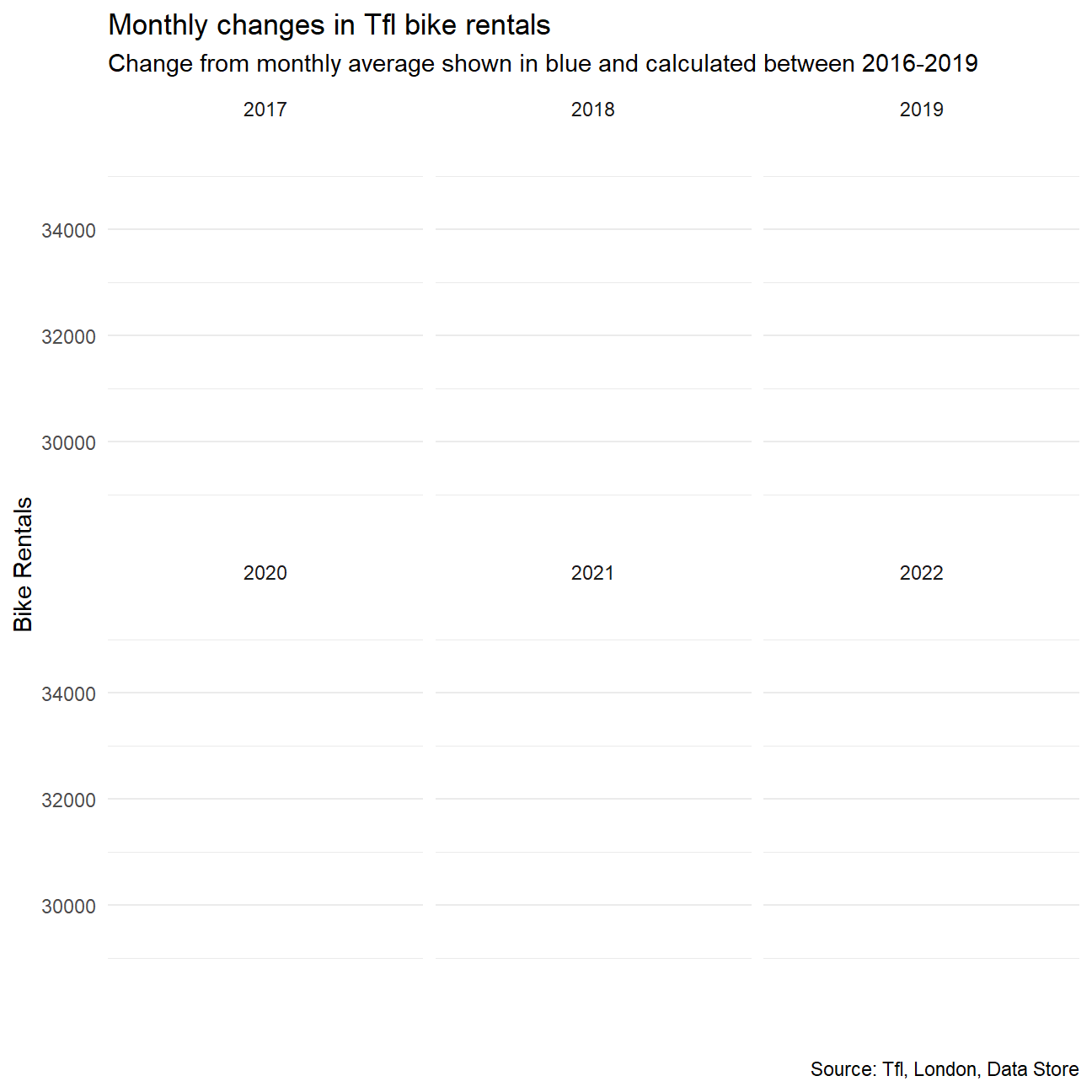
bike3 <- bike %>%
  mutate(month=match(month,month.abb)) %>%
  filter(!(month==1 & week == 52)) %>%
  filter(year>2015) %>%
  group_by(week,year) %>%
  summarize(weekly_mean = mean(bikes_hired))


bike_weekly_2016_to_2019 <- bike %>%
    filter(2015<year & year<2020) %>%
    group_by(week) %>%
    summarize(weekly_mean_2016_2019 = mean(bikes_hired))

bike_weekly_merged<-merge(x=bike3,y=bike_weekly_2016_to_2019,by="week") %>%
  filter(year>2016) %>%
  mutate(pct_change_weekly = (weekly_mean/weekly_mean_2016_2019-1)*100)


ggplot(data=bike_weekly_merged, aes(x=week)) +

  geom_rect(aes(xmin = 13, xmax = 27, ymin = -Inf, ymax = Inf), fill="light gray") +

  geom_rect(aes(xmin = 39, xmax = 52, ymin = -Inf, ymax = Inf), fill="light gray") +

  geom_rect(aes(xmin = 0, xmax = 13, ymin = -Inf, ymax = Inf), fill="white") +

  geom_rect(aes(xmin = 27, xmax = 39, ymin = -Inf, ymax = Inf), fill="white") +

  geom_line(aes(y=pct_change_weekly)) +

  geom_ribbon(aes(x=week,
                   ymin = 0,
                   ymax = pmax(0, pct_change_weekly)),
                   alpha=0.1, fill='green') +

  geom_ribbon(aes(x=week,
                   ymin = pct_change_weekly,
                   ymax = pmax(0, pct_change_weekly)),
               alpha=0.1, fill='red') +

  guides(linetype = "none", fill = "none") +

  labs(title = "Weekly changes in Tfl bike rentals", subtitle = "Change from weekly averages calculated between 2016-2019", x='week', y='', caption = "Source: Tfl, London, Data Store") +

  theme(legend.position = 'none') +
  facet_wrap(~year)+
  scale_fill_manual(values=c("green", "red"), name="fill") +
  geom_rug(aes(color=case_when(pct_change_weekly>0~"red",
                               pct_change_weekly<0~"green"))
            ,sides="b") +

  scale_color_manual(values=c("red", "green"), name="color") +

  xlim(0,52) +

  NULL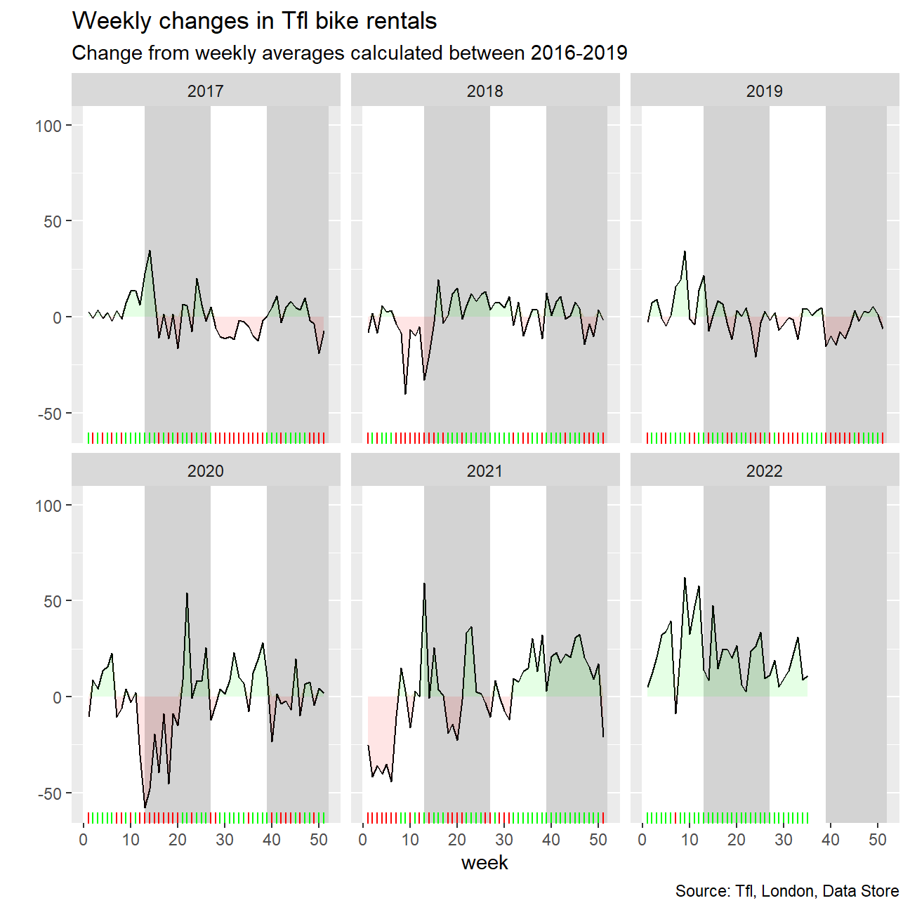
Should you use the mean or the median to calculate your expected rentals? Why?
The mean should be used as the bike rentals during a month follow a normal distribution and not a skewed distribution. As such, mean can be used for the calculation.
Challenge 2: Share of renewable energy production in the world
technology <- readr::read_csv('https://raw.githubusercontent.com/rfordatascience/tidytuesday/master/data/2022/2022-07-19/technology.csv')

#get all technologies
labels <- technology %>%
  distinct(variable, label)

# Get country names using 'countrycode' package
technology <- technology %>%
  filter(iso3c != "XCD") %>%
  mutate(iso3c = recode(iso3c, "ROM" = "ROU"),
         country = countrycode(iso3c, origin = "iso3c", destination = "country.name"),
         country = case_when(
           iso3c == "ANT" ~ "Netherlands Antilles",
           iso3c == "CSK" ~ "Czechoslovakia",
           iso3c == "XKX" ~ "Kosovo",
           TRUE           ~ country))

#make smaller dataframe on energy
energy <- technology %>%
  filter(category == "Energy")

# download CO2 per capita from World Bank using {wbstats} package
# https://data.worldbank.org/indicator/EN.ATM.CO2E.PC
co2_percap <- wb_data(country = "countries_only",
                      indicator = "EN.ATM.CO2E.PC",
                      start_date = 1970,
                      end_date = 2022,
                      return_wide=FALSE) %>%
  filter(!is.na(value)) %>%
  #drop unwanted variables
  select(-c(unit, obs_status, footnote, last_updated))

# get a list of countries and their characteristics
# we just want to get the region a country is in and its income level
countries <-  wb_cachelist$countries %>%
  select(iso3c,region,income_level)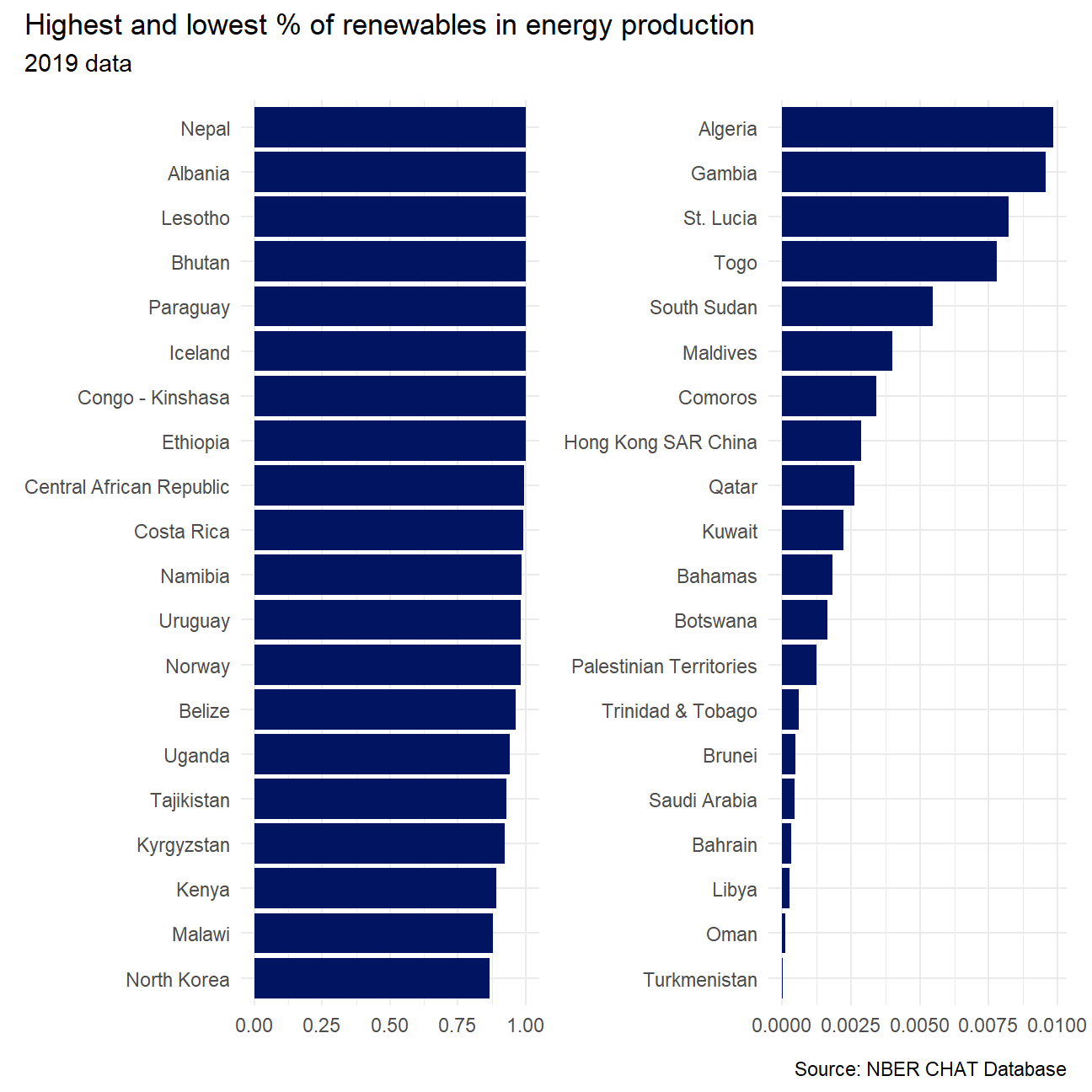
As the % of energy generated by renewables goes up, do CO2 per capita emissions seem to go down?
  labs(title = 'Year: {frame_time}',
       x = '% renewables',
       y = 'CO2 per cap') +
  transition_time(year) +
  ease_aes('linear')
energy %>%
select(-label, -category, -group) %>%
pivot_wider(names_from = variable, values_from = value) %>%
mutate(prop_renewable = (
elec_hydro+elec_solar+elec_wind+elec_renew_other)/elecprod
) %>%
select(iso3c, country, year, prop_renewable) %>%
left_join(countries, by="iso3c") %>%
left_join(
co2_percap %>% select(iso3c, date, value),
by=c("iso3c" = "iso3c", "year" = "date")
) %>%
na.omit() -> all_elec_data
all_elec_data %>%
ggplot(aes(x=prop_renewable, y=value)) +
geom_point(aes(color=income_level)) +
facet_wrap(~income_level) +
labs(
title="Year: {as.integer(frame_time)}",
x = "% renewables",
y = "CO2 per cap"
) +
theme_minimal() +
theme(legend.position = "none") +
transition_time(year) +
view_follow(fixed_y = TRUE) +
ease_aes('linear') -> anim_plot
animate(anim_plot)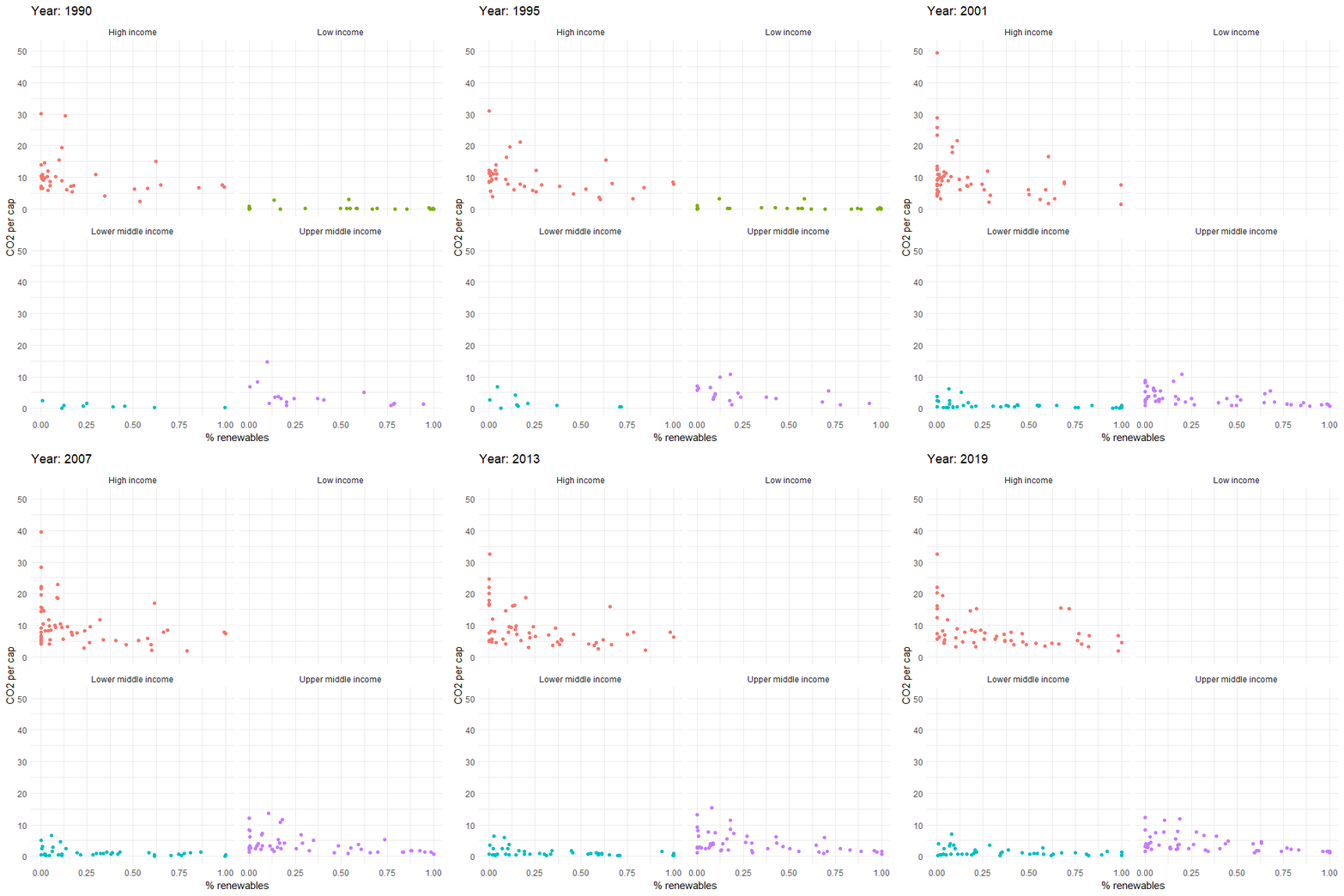
Looking at this visualisation it seems there is no correlation between two variables. The CO2 per capita does not seem to go down as the percentage of renewables go up. For most of the countries the CO2 per capita stays the same, while % of renewables change. However, it is difficult to determine if the statement is true or false just looking at the animation without running proper tests.